This post may contain affiliate links. Read the full disclosure here.
Designing a nursery is one of those exciting projects that can feel both thrilling and completely overwhelming! As a mom of three boys, I’ve been through the nursery setup process more times than I can count, and I’ve learned that choosing the right color palette makes all the difference in creating a space that feels calm, inviting, and totally timeless.
Gender neutral nursery colors have become my absolute favorite approach because they’re so versatile and create such a peaceful atmosphere! Whether you’re waiting to find out your baby’s gender, planning for future siblings to share the room, or simply love the modern aesthetic of neutral tones, these color schemes work beautifully for any family. Let me share what I’ve discovered about creating that perfect calm and modern nursery space!
Why Gender Neutral Nursery Colors Are Perfect for Modern Families

Let me tell you, after setting up three different nurseries, I’ve come to absolutely love the flexibility that gender neutral nursery colors provide! There’s something so refreshing about moving away from the traditional pink-or-blue mentality and embracing colors that feel sophisticated, calming, and genuinely beautiful.
The practical benefits are amazing too! When you choose neutral colors, you’re creating a space that can easily transition as your little one grows. I didn’t have to repaint when my second son arrived, and the nursery still looked perfect for my third! Plus, these colors tend to coordinate beautifully with all those adorable baby gifts and hand-me-downs you’ll receive in every color imaginable.
Modern families are also increasingly conscious about not imposing gender stereotypes from day one, and neutral nursery colors support that beautifully! Your baby’s room can be a peaceful sanctuary that celebrates them as an individual, without all the predetermined expectations that come with traditional color choices. It’s about creating a space where imagination and personality can flourish!
From a design perspective, neutral palettes are incredibly forgiving and easy to work with. You can mix different textures, patterns, and accent pieces without worrying about everything clashing. Trust me, when you’re sleep-deprived and dealing with a crying baby, the last thing you want is a room that feels visually overwhelming!
Soft Sage and Cream: Nature-Inspired Tranquility
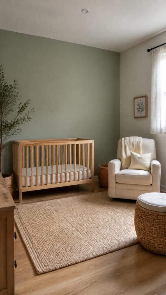
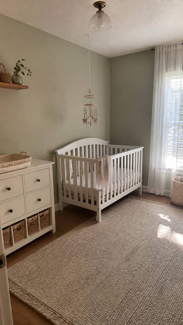
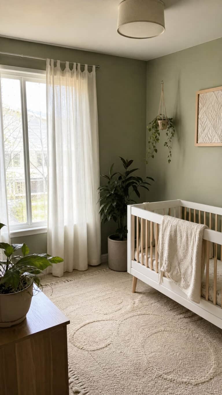
Oh my goodness, sage green has stolen my heart! This beautiful, muted green paired with creamy whites creates such a serene, nature-inspired environment that I used variations of it for all three of my boys’ rooms. Sage is one of those perfect gender neutral nursery colors that feels fresh and modern without being cold or sterile.
The beauty of sage and cream is how it brings the outdoors inside! This combination creates a connection to nature that feels inherently calming. I’ve noticed that these colors seem to create a more peaceful environment during those late-night feedings and diaper changes. Maybe it’s psychological, but I swear my boys settled down faster in their sage-toned rooms!
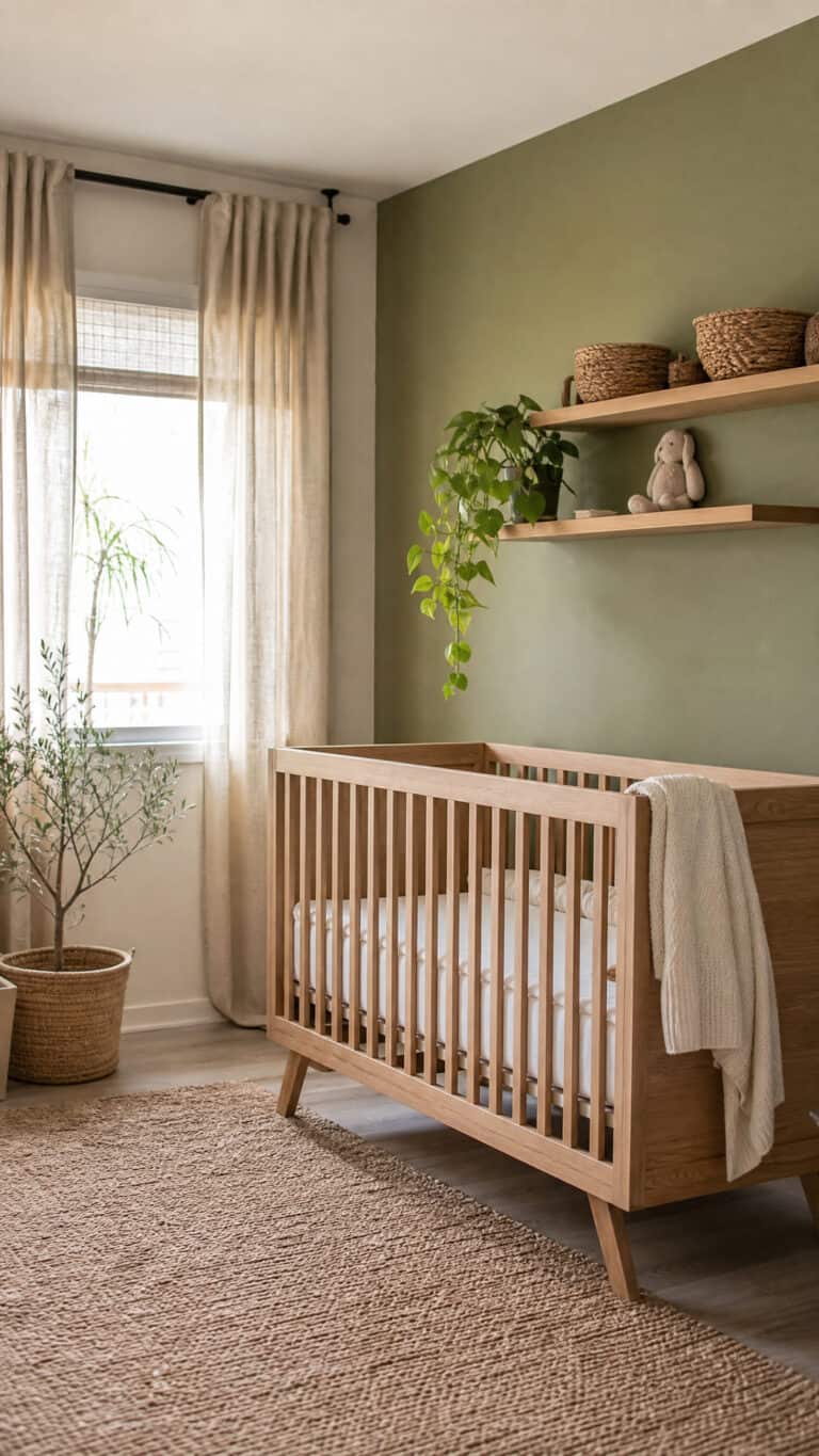
When working with sage and cream, consider using the cream as your base wall color and incorporating sage through furniture, textiles, and decor. A sage-colored glider or accent wall can be stunning! You can also reverse this and go with sage walls and cream furniture for a bolder look. I painted one accent wall in sage behind the crib, and it became the perfect focal point.
This color combination also pairs beautifully with natural wood tones, which adds warmth and texture to the space. Think light oak or birch furniture, wooden toys, and woven baskets. Add some actual plants if you can keep them alive (no judgment if you can’t – I’ve killed my share!), or opt for some really convincing faux greenery to complete that natural, organic feel.
Warm Taupe and White: Timeless Sophistication
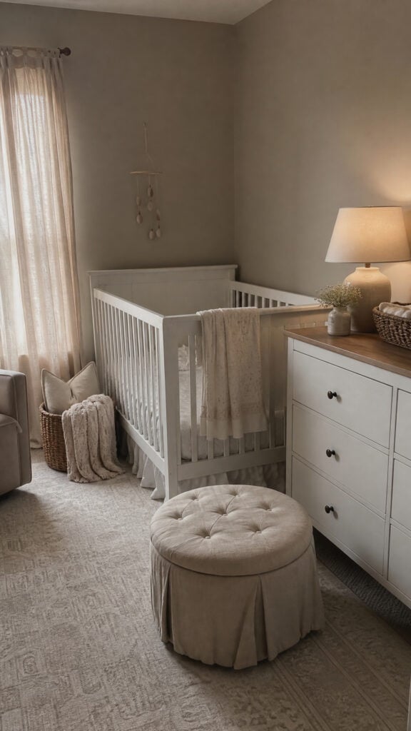
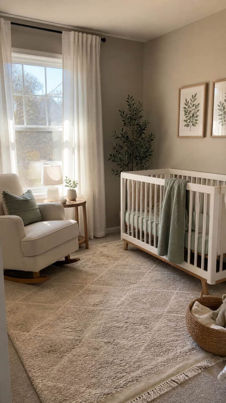
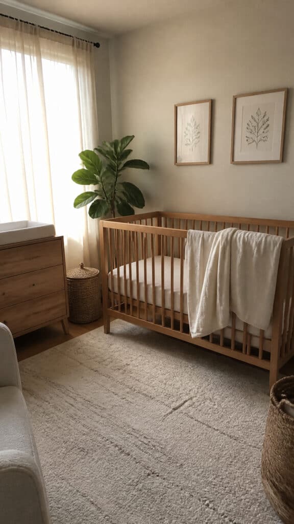
If you want a nursery that photographs like a magazine spread but still feels cozy and livable, warm taupe and white is your answer! This is probably the most classic of all gender neutral nursery colors, and there’s a reason it never goes out of style. It’s sophisticated, calming, and creates the perfect backdrop for all those cute baby items.
Taupe is such a chameleon color – it can lean more gray or more beige depending on the lighting and what you pair it with. I love how it creates depth without being too dark or heavy. When combined with crisp white, you get this beautiful contrast that feels clean and modern but still warm and inviting. It’s the perfect balance!
The key to making taupe and white work is layering different shades and textures. Don’t just paint everything one flat color and call it done! Use a lighter taupe on the walls, maybe a deeper taupe for curtains or a rug, and then bring in white through the crib, changing table, and bedding. Add texture with knitted blankets, linen curtains, and maybe a sheepskin rug.
This color scheme is also incredibly versatile when it comes to accent colors. You can add pops of literally any color – mustard yellow, terracotta, navy blue, or even black for a more dramatic look. As your child grows, it’s so easy to switch up the accent colors without repainting! I’ve changed out throw pillows and artwork to completely refresh the look without any major renovation.
Soft Gray and Ivory: Modern Minimalism
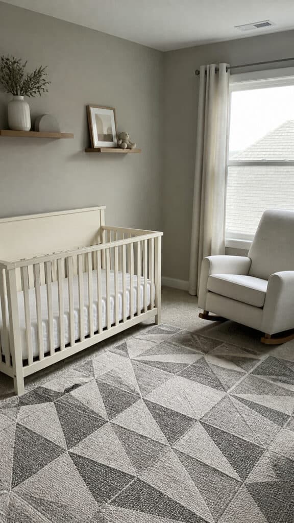
Gray gets a bad reputation sometimes for being cold, but when you choose the right shade and pair it with warm ivory, it’s absolutely beautiful! Soft, warm grays are fantastic gender neutral nursery colors that create a modern, minimalist vibe that I find incredibly soothing. The trick is avoiding those cool, blue-toned grays and sticking with warmer undertones.
I’m a huge fan of the clean, uncluttered look that gray and ivory creates. As a mom of three, I can tell you that babies come with SO much stuff! Having a calming, minimalist color palette helps the room feel more organized and less chaotic, even when there are toys and baby gear everywhere. It’s like the colors do some of the organizational heavy lifting for you!
When working with gray and ivory, pay attention to your lighting. Natural light will make these colors sing, but if your nursery doesn’t get much natural light, make sure to add plenty of warm artificial lighting. I installed a dimmer switch in my youngest’s nursery, and it was a total game-changer for those middle-of-the-night visits!
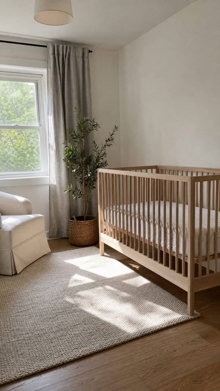
This palette is perfect if you love a Scandinavian or modern aesthetic. Keep furniture simple and functional, embrace negative space, and let the beautiful simplicity of the colors shine. You can add warmth with wood accents, texture with woven baskets and macramé wall hangings, and personality with black-and-white prints or simple line drawings. It’s sophisticated without being fussy!
Warm Beige and Terracotta: Earthy and Inviting
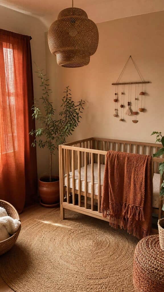
Can we talk about how amazing warm, earthy tones are for a nursery? Beige and terracotta together create such a cozy, grounded feeling! These gender neutral nursery colors have become super trendy lately, and I’m totally here for it. There’s something about these warm, desert-inspired tones that feels both modern and timeless at the same time.
Terracotta is such a beautiful accent color – it’s warm without being overwhelming, and it adds just the right amount of color without feeling too bold for a baby’s room. I love using beige as the main wall color and then bringing in terracotta through textiles, artwork, and smaller decor pieces. A terracotta-colored pouf or throw blanket can add such a gorgeous pop of warmth!
This color combination works beautifully with natural materials like rattan, jute, and clay. Think woven light fixtures, jute rugs, rattan baskets for storage, and maybe some terracotta planters (with or without actual plants!). The textures add so much interest and keep the space from feeling flat or boring.
What I love most about this palette is how inviting it feels. When you walk into a nursery with these warm, earthy tones, it just feels like a hug! It’s cozy and comforting, which is exactly what you want for your baby’s space. Plus, it photographs beautifully – not that we’re taking a million photos of our babies or anything! You can easily add in touches of cream, sage green, or even dusty pink or blue if you want to incorporate some subtle traditional colors later on.
Pale Yellow and Gray: Cheerful Yet Calm
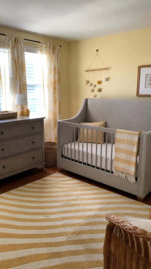
Okay, I have to admit that pale yellow might be my secret favorite! It’s such a happy, cheerful color that still manages to feel calm and soothing when you choose the right shade. Paired with soft gray, it’s one of those gender neutral nursery colors that brings sunshine into the room without being overwhelming or too bright!
The key with yellow is going pale and buttery rather than bright and bold. Think vanilla custard or fresh cream rather than sunshine or lemon. These softer yellows create warmth and optimism without being visually stimulating in a way that might be too much for a baby’s space. I used a pale yellow in one of my son’s rooms, and every time I walked in, it just made me smile!
Gray is the perfect partner for pale yellow because it grounds the cheerfulness and adds sophistication. Use gray for larger furniture pieces like the crib and dresser, and bring in yellow through the walls, bedding, or curtains. Or flip it – gray walls with yellow accents work beautifully too! The combination feels fresh and modern while still being soft and nursery-appropriate.
This color scheme is also really forgiving when it comes to adding other colors. You can bring in white for crispness, natural wood for warmth, or even small touches of navy or coral for additional interest. It’s such a versatile palette! And as your baby grows, this combination transitions really well into a toddler room. Just swap out some of the baby items for more grown-up pieces, and the color scheme still works perfectly.
Soft Blue-Gray and Cream: Serene and Sophisticated
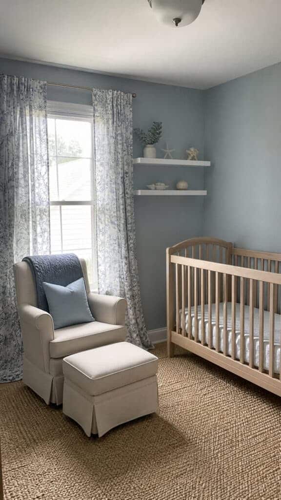
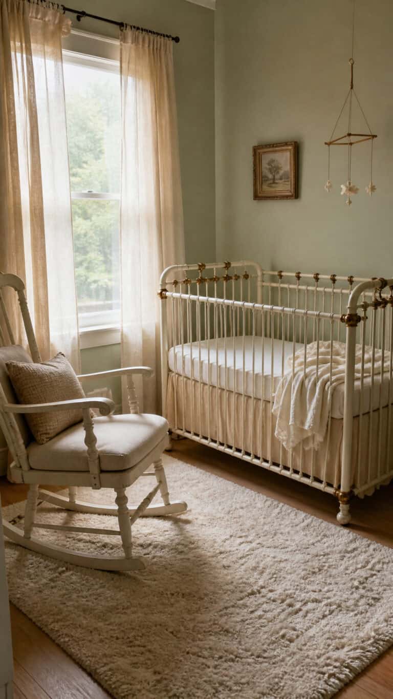
Blue-gray is such a beautiful compromise if you love blue but want to keep things neutral! This color walks the line perfectly between traditional and modern, and when paired with cream, it creates one of the most serene color combinations imaginable. These gender neutral nursery colors feel sophisticated and calming – perfect for creating that peaceful sleep environment we all dream about!
The beauty of blue-gray is that it has that calming quality we associate with blue, but the gray tones it down and makes it feel more neutral and versatile. It’s not screaming “boy’s room” the way a bright blue might, but it still has that soothing, tranquil vibe. I’ve found that these cooler tones can be especially nice in nurseries that get a lot of afternoon sun and tend to run warm.
Cream adds essential warmth to blue-gray and keeps the room from feeling cold or sterile. Use cream for furniture, bedding, and curtains to soften the cooler wall color. You can also bring in natural wood tones, which look absolutely gorgeous against blue-gray! A natural wood crib or changing table adds warmth and organic texture that complements the color scheme perfectly.
This palette is ideal if you love a coastal, nautical, or even a slightly preppy aesthetic. You can add white for crispness, navy for depth, or even touches of coral or blush for a softer feel. It’s such a flexible foundation! And honestly, this is one of those color schemes that looks beautiful in photos, which is definitely a bonus when you’re documenting every precious moment of your baby’s first year!
Creating Your Perfect Calm Nursery
Choosing gender neutral nursery colors is such a wonderful way to create a calm, modern space that will grow with your baby and work for any future siblings too! Whether you’re drawn to the earthy warmth of beige and terracotta, the fresh serenity of sage and cream, or the sophisticated simplicity of gray and ivory, there’s a neutral palette that’s perfect for your family’s style and needs.
Remember, there’s no wrong choice here! The best nursery is one that makes you feel calm and happy when you walk into it, because let’s be honest – you’re going to be spending a LOT of time in that room! Trust your instincts, choose colors that speak to you, and don’t be afraid to add your own personal touches. Your baby’s nursery should reflect your family’s unique style while creating that peaceful sanctuary you both need. Happy decorating, mama!